
Digital Product Design & High-Conversion UI/UX
Premium digital product design, user research, interactive Figma prototypes, and conversion rate optimized enterprise design systems nationwide.
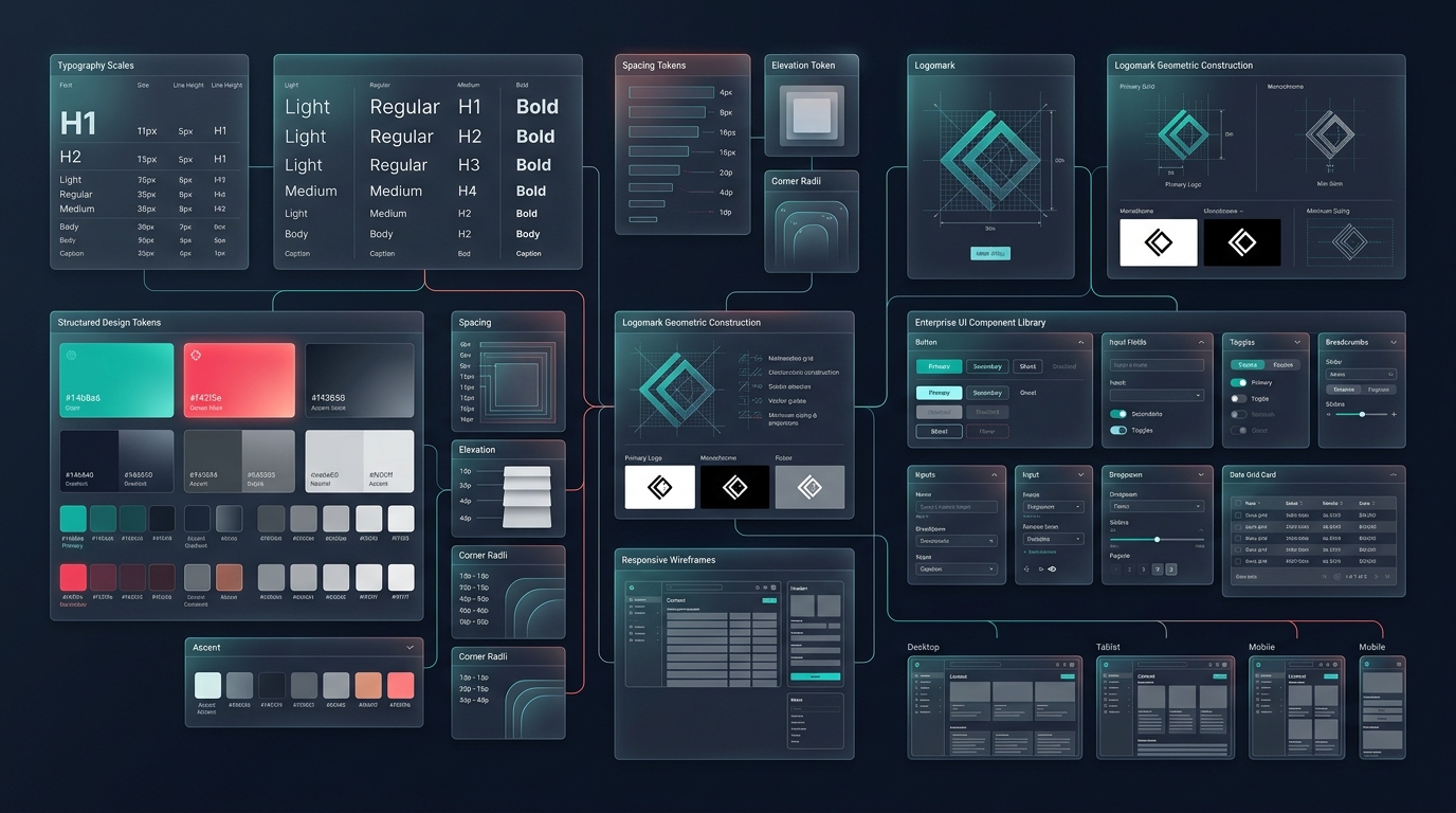
Core Capabilities & Engineering Deliverables
-
Conversion Rate Optimized (CRO) Interfaces
Data-informed UX architectures designed to reduce bounce rates, streamline checkout funnels, and boost conversion velocity.
-
Figma Design Systems & Token Architecture
Scalable, component-driven design systems with reusable atomic tokens, dark/light mode variants, and responsive breakpoints.
-
Interactive Clickable Prototypes
High-fidelity interactive prototypes allowing stakeholder testing and user validation prior to writing production code.
-
Accessibility & WCAG 2.1 AA Compliance
High-contrast palettes, accessible keyboard navigation, and screen-reader compliant UI components.
How to Evaluate Digital Product Design & High-Conversion UI/UX
Web design should make the next decision easier for a visitor, whether that decision is to understand an offer, compare options, request a conversation, or complete a transaction. This hub covers research, structure, interface design, accessibility, content hierarchy, and design systems so teams can connect visual work to a real customer journey.
When a website redesign solves a real revenue problem
A visual refresh alone rarely fixes conversion rates if visitors still cannot tell what you sell, who it is for, or what happens after they submit a form. Redesign work is worth the investment when sales teams keep answering the same basic questions, mobile visitors drop off before scrolling, or legacy layouts break accessibility standards.
Information hierarchy before color palettes
- Base page structure on visitor questions and decision stages rather than internal department labels.
- Validate important flows with representative users before development locks in assumptions.
- Design responsive, accessible components that remain understandable as content changes.
We start with content architecture, low-fidelity wireframes, and real copy drafts rather than lorem ipsum mockups. Designing around actual headlines, comparison tables, pricing tiers, and trust evidence prevents cramped cards and awkward mobile wrapping once engineering starts.
Reusable design systems built for developers
You receive organized Figma component libraries with defined spacing scales, typography tokens, WCAG 2.1 AA color-contrast pairs, interactive hover/focus states, and responsive breakpoints for desktop, tablet, and mobile so engineers build consistently without guesswork.
Design habits that silently hurt SEO and speed
Oversized hero videos, custom web fonts loaded in six weights, layout-shifting carousels, and text baked inside images drag down Core Web Vitals and frustrate phone users. We design crisp visual hierarchy that loads fast on ordinary cellular connections.
Structured design milestones with zero late-stage surprises
Week 1 delivers sitemap hierarchy and clickable low-fidelity wireframes using real draft copy. Week 2 establishes visual direction and reusable component tokens across desktop and mobile, followed by full page templates and developer handoff annotations.
How we validate visual quality and usability
Every template is checked for WCAG 2.1 AA text and interactive contrast ratios, clear tap targets on small phone viewports, predictable layout behavior with longer headings, and lightweight asset budgets that keep LCP fast.
Balancing design system depth with launch speed
Milestone 1 delivers information architecture, responsive wireframes, a practical component kit (buttons, cards, forms, navigation, pricing), and high-priority commercial templates. Exhaustive illustration libraries, dark-mode secondary themes, and motion micro-interactions can be added iteratively once core conversion pages are live and collecting real user behavior.
Helpful inputs before design exploration starts
- Existing brand logos, color preferences, and examples of competitor sites you admire or dislike.
- Current Google Analytics or Hotjar notes showing where mobile visitors drop off today.
- Draft service lists, pricing structure, and mandatory trust or compliance badges.
- Target CMS or frontend stack (React, Next.js, Shopify, WordPress) so layouts fit naturally.
Questions about our web design process
- Do you write or refine page copy alongside wireframes?
- We draft realistic structural headlines, CTAs, and section hierarchy during wireframing instead of using placeholder Latin text, so visual spacing reflects real buyer messaging from the start.
- Can our own developers build from your Figma files?
- Yes. Every Figma handoff includes named design tokens, desktop and mobile breakpoints, hover/focus/error states, and clear spacing annotations so any frontend engineer can implement accurately.
Commercial Delivery Standards & Assurance
- Full Component-Based Figma Master File Handover
- Conversion-Engineered User Flows & Wireframes
- Mobile-First Responsive Breakpoints (Mobile, Tablet, Desktop)
- WCAG 2.1 AA Compliant Color Contrast & Typography
- Developer-Ready Asset Export & Style Guide Documentation
Frequently Asked Technical Questions
- What deliverables are provided in the UI/UX design phase?
- Deliverables include complete Figma source files, responsive screen layouts, design system tokens, interactive prototypes, and developer handoff documentation.
- How do you ensure UI designs convert visitors into customers?
- We apply behavioral psychology, visual hierarchy, clear call-to-action placement, low-friction checkout flows, and usability heuristics tailored to your target audience.